There’s a lot that can go wrong when ordering bulk T-shirts on a budget. If you’ve ever been in charge of ordering them, you know it’s more than just picking a color and clicking “buy.” There are budgets, deadlines, size charts, and the pressure of knowing that the whole group is depending on you to pick the right option.
More than anything, it needs to hold up through real use: sports practices, events, repeated wear, and frequent washes. The difference usually comes down to choosing the right blank for the specific situation.
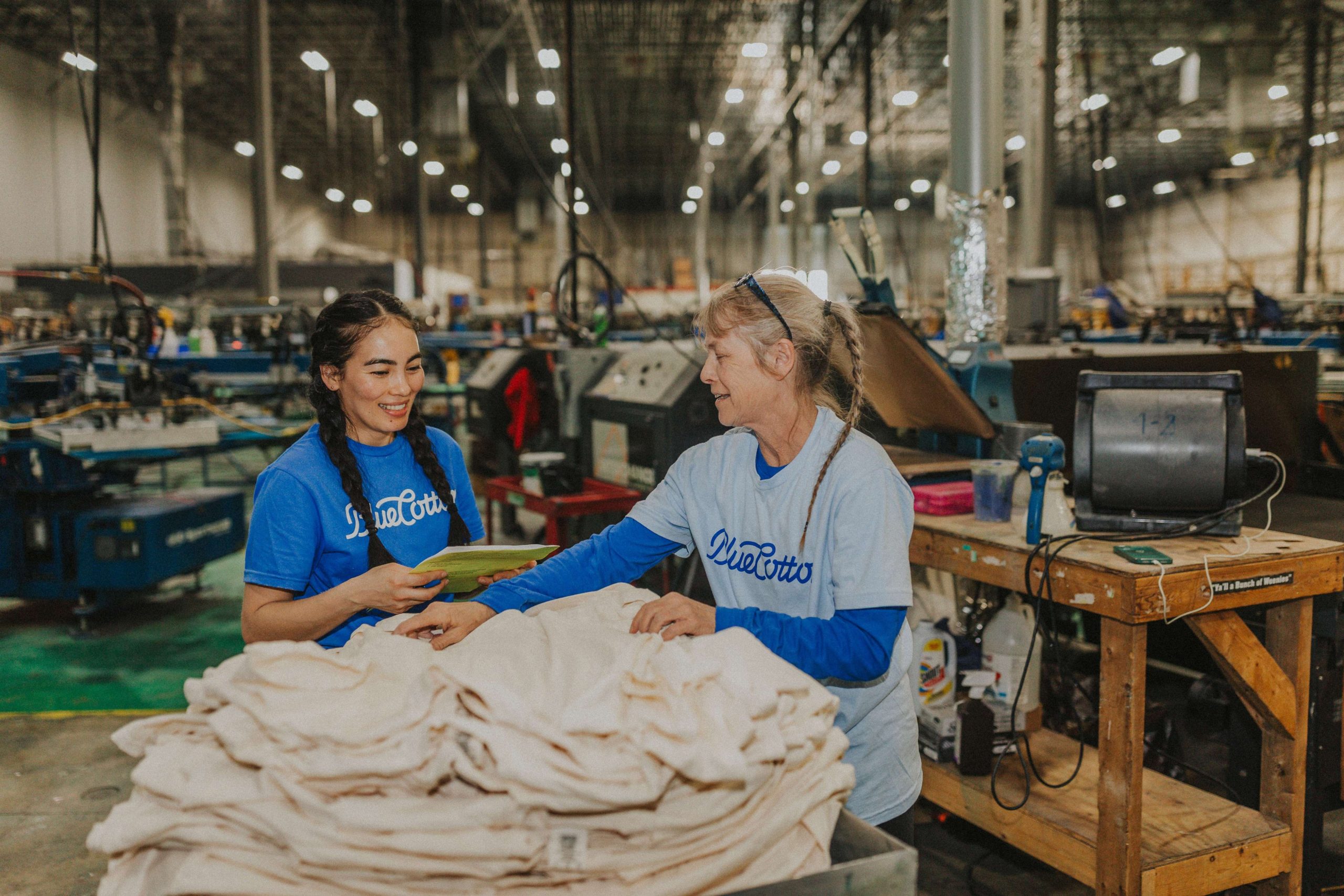
So let’s go over some of the best bulk T-shirt options for teams and organizations working with a budget, based on decades of experience. These picks consistently deliver solid quality at an affordable price.
Gildan 8000 DryBlend 50/50: Best for Youth Sports Teams
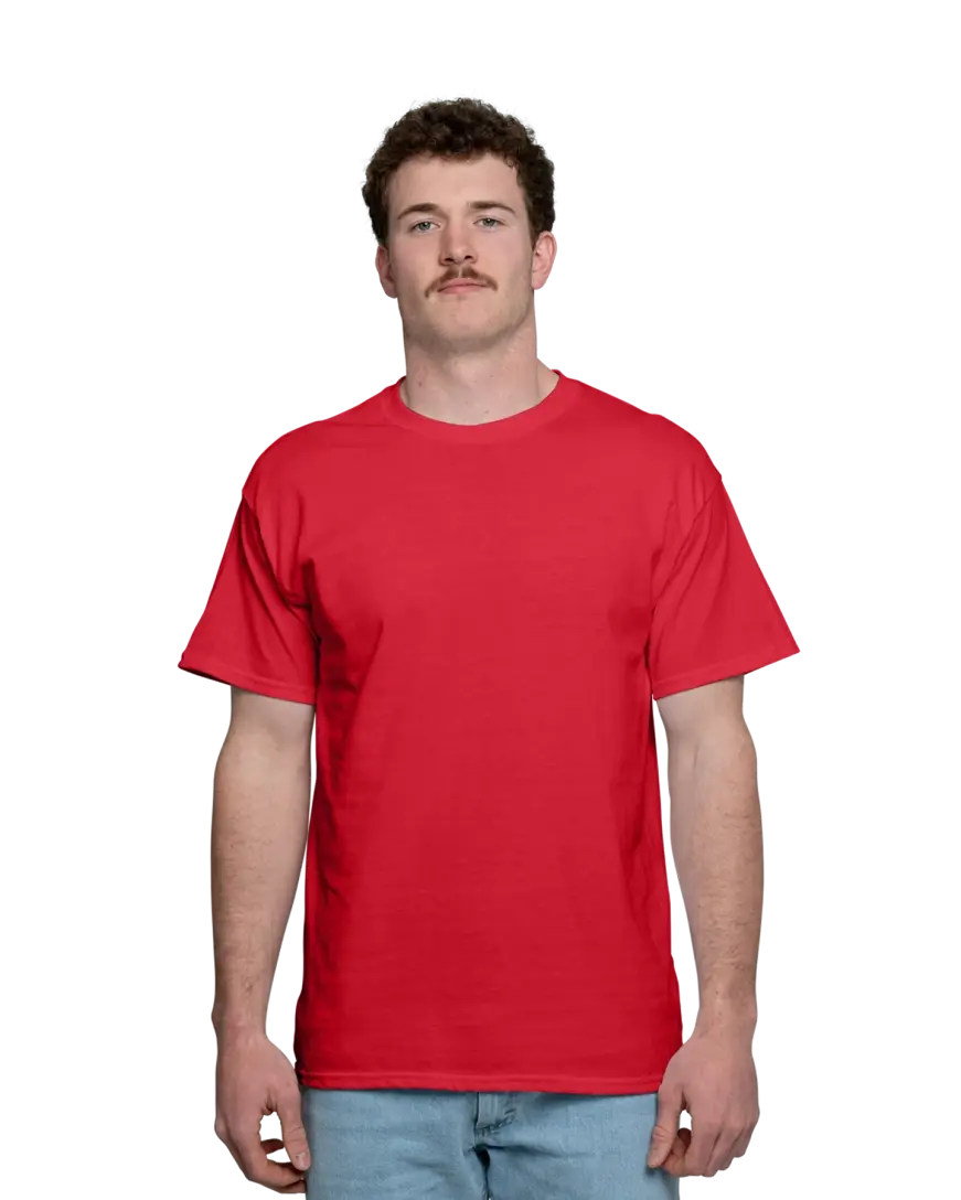
The challenge: Parents want shirts that survive the season. Coaches need something affordable enough to outfit every player and ideally grab a few extras. Kids are sweating through practice, rolling in the grass, and running their shirts through the wash twice a week.
Gildan’s DryBlend 50/50 is built from a preshrunk 50% cotton/50% polyester blend that actively wicks moisture away from the body and helps prints stay sharper over time — a meaningful upgrade over a standard cotton tee when kids are active. At 5.6 oz., it has enough weight to feel substantial without being heavy. Plus, double-needle stitching throughout and taped shoulder-to-shoulder construction mean it is not going to fall apart after ten washes. And with 31 color options, you’ll have no trouble matching your team.
It’s a durable, practical choice that keeps kids comfortable during practice and looks sharp for game day, all at a price that lets you stock up without blowing the uniform budget.
Gildan 5000 Heavy Cotton: Best for School Events & Community Fundraisers
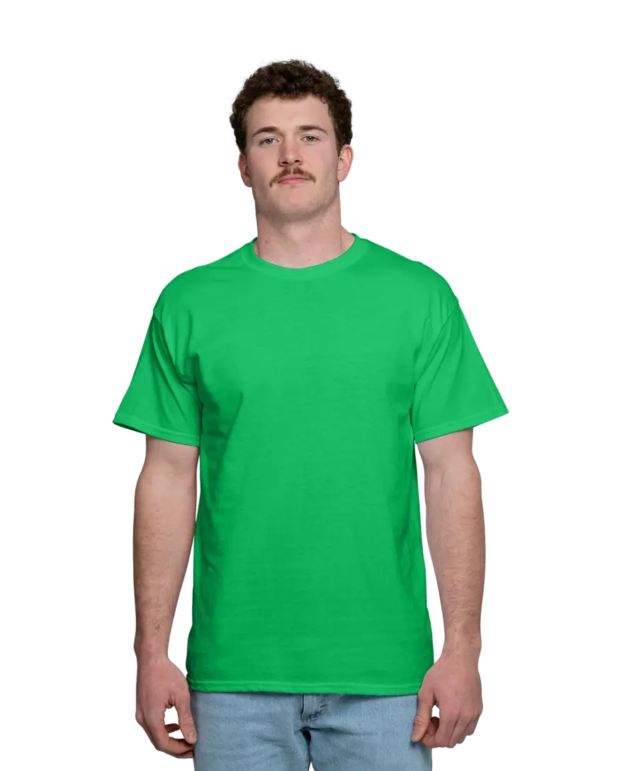
The challenge: School spirit wear and fundraiser shirts need to fit everyone of all body shapes, from kindergarteners to teachers to grandparents showing up for the 5K. That means you need a wide size range, a big color selection to match your school colors, and a price per shirt that makes the fundraiser actually worth running.
At 5.3 oz. of pre-shrunk 100% cotton, the Gildan 5000 Heavy Cotton tee has a classic, comfortable fit that most people are already familiar with. It’s not a performance tee and not fashion-forward — it’s the reliable shirt that works for everyone from the student council president to the booster club volunteer. The 7/8″ seamless collar and double-needle stitching give it a clean, finished look that holds up through an entire school year.
It’s available in 65 colors (one of the widest selections available), so matching your exact school palette is almost always possible. Sizes span youth XS through adult 5XL, giving you the coverage you need for a school-wide event without placing separate orders for different age groups. To get a good idea of the fit, check out how Mike and Julie rock this popular shirt.
When you need to outfit hundreds of people across a wide size range in your school colors, the Gildan 5000’s color depth and size breadth make it a practical pick. The price point means more proceeds stay in the fundraiser fund.
Gildan 2000 Ultra Cotton: Best for Church Groups & Mission Trips

The challenge: Mission trips and large church events often involve ordering for a big group all at once, and the budget is frequently tight because you’re funding something much larger than just the shirts. Quantities can be high, and the shirt has to survive whatever environment the trip takes you to.
The Gildan 2000 Ultra Cotton is the heavyweight of the Gildan lineup at 6.1 oz. It’s thicker and more durable, built with double-needle stitching throughout and a taped neck and shoulders for a clean, structured fit. The preshrunk cotton means it won’t shrink dramatically after the first wash, which really matters when people are wearing these shirts in varied conditions. It also comes in 58 colors, with both adult and youth sizing options, so you can coordinate the whole group without mixing shirt styles.
The Gildan 2000’s heavyweight feel makes it something people actually want to keep and wear after the trip is over. It’s also one of the most cost-effective options for bulk orders. Our pricing scales with quantity, so the more you order, the better the per-shirt price gets. For a group trip where you are ordering 50, 75, or 100+ shirts at once, the savings add up fast.
Gildan 64000 SoftStyle: Best for Corporate Employee Uniforms on a Budget
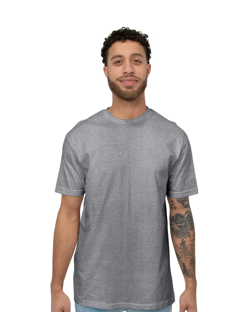
The challenge: Employee uniforms need to look polished enough that customers and clients take them seriously, while staying comfortable enough to work in and affordable enough to refresh each season or replace as staff turns over.
The Gildan 64000 SoftStyle tee has the softness of ring-spun cotton at a budget-friendly price point. It’s noticeably softer than standard tees, the kind of shirt employees will actually want to wear rather than change out of the moment their shift ends. At 4.5 oz., it’s lightweight and breathable, which is especially important for staff who are on their feet and moving around all day.
Compared to the standard Gildan tees, the 64000 fits slightly tighter with a smaller collar and has a polished retail look. The shirt comes in over 62 colors, and you can add personalized names using our design studio, which is particularly useful for customer-facing roles. Sizes run from YXS up to 5XL.
The 64000 delivers a professional appearance at a price that works for bulk uniform budgets.
Why BlueCotton Is the Smart Bulk Choice
Once you’ve landed on the right shirt, the next question is how to get the best deal on a bulk order without running into the usual headaches — hidden fees, inconsistent quality, or a delivery date that turns out to be more of a suggestion.
That’s where BlueCotton comes in.
Our bulk pricing kicks in at just six pieces and gets better as your order grows, so whether you’re outfitting a dozen volunteers or a couple hundred employees, the per-shirt cost scales in your favor. Our Quick Price tool shows you the exact cost across the full lineup before you commit, and the number you see while designing your shirt is the number you pay at checkout: per-shirt price, total cost, shipping tiers, personalization, all of it laid out upfront with nothing tacked on at the end.
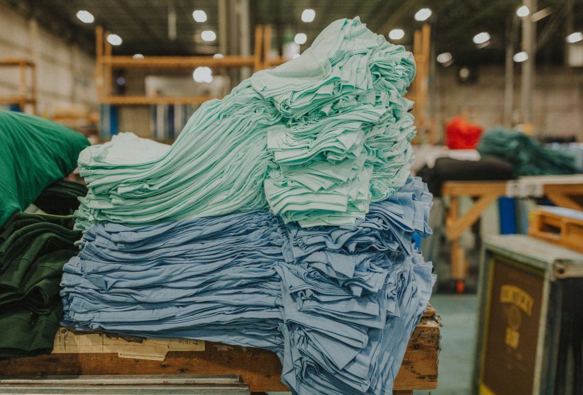
That kind of pricing consistency is possible because we handle everything in-house. Design, printing, embroidery, packaging, and shipping all happen at our facility in Kentucky, with the same team touching every order from start to finish. There are no outside vendors adding markups or introducing delays, which is also how we’re able to guarantee a delivery date on every order. Standard shipping is free and arrives within 10 business days, with rush options available at 5 days, 3 days, or even same-day for those last-minute situations.
Before anything goes to print, a BlueCotton artist reviews your design to make sure it translates well to the actual garment, and you approve a digital proof before production begins. It’s a small step that saves a lot of wasted money and frustration on the back end.
Finding the Right Shirt for Your Bulk Order
Ordering custom shirts for a group doesn’t have to be complicated. Whether you’re outfitting ten volunteers or two hundred employees, the process is the same.
Start by identifying your primary constraint: If durability is the priority, go with the Gildan 8000 or the 2000. If you need the widest color and size range, the 5000 is hard to beat. If the shirt needs to look polished enough for a professional setting, the 64000 is worth a look.
Then, just use our Quick Price tool to see exactly what your order will cost before you commit. Upload your logo or build your design in the design studio, review the proof, and your order ships with a guaranteed delivery date.