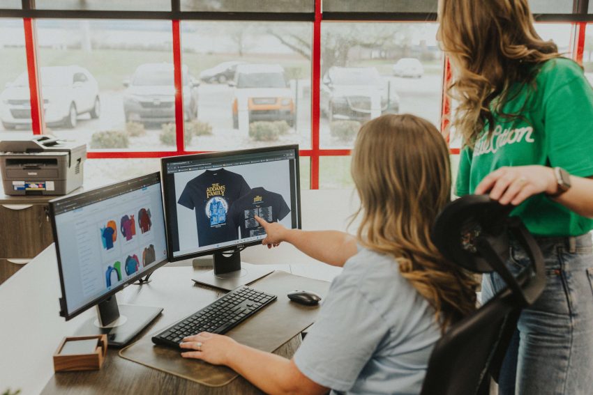
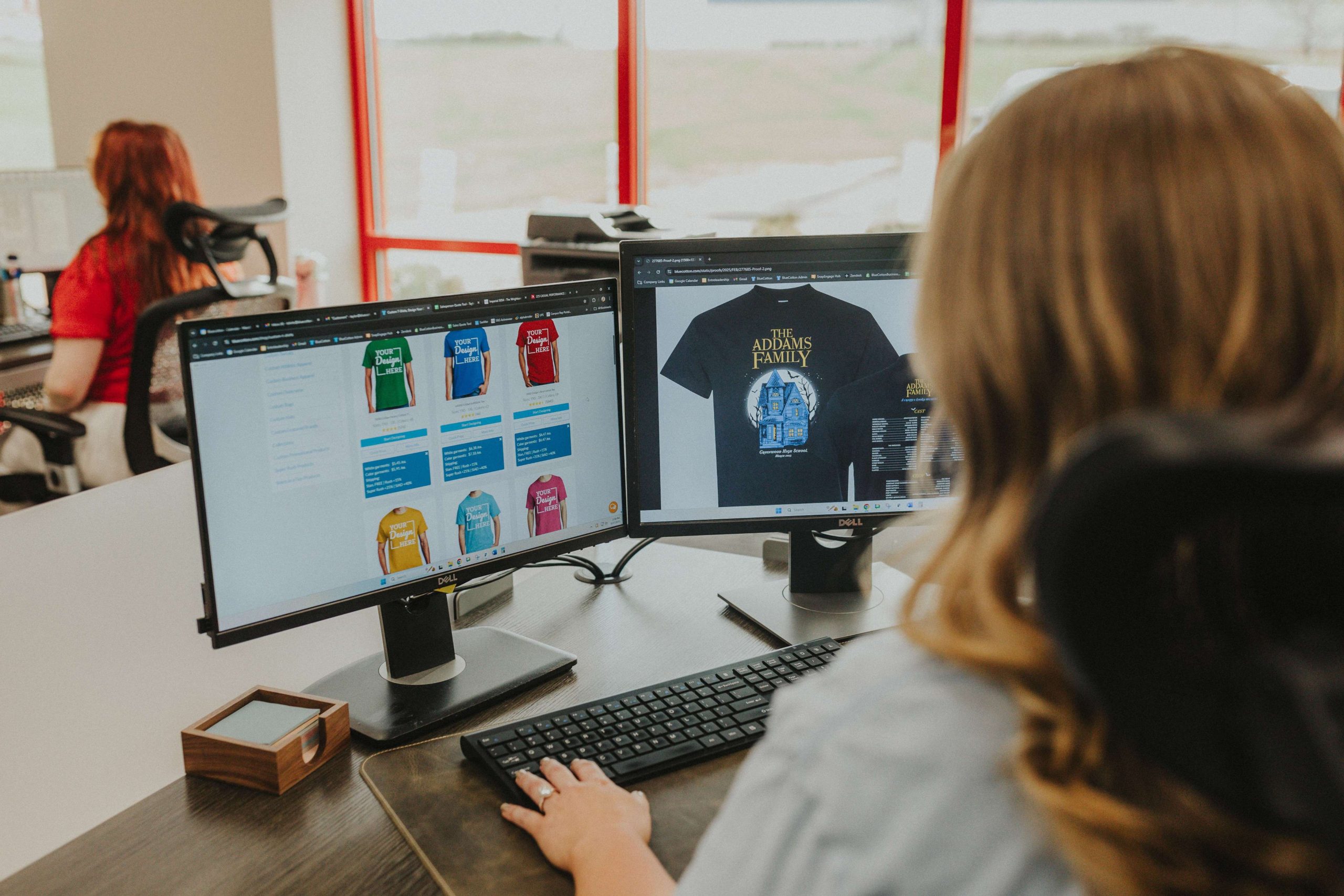
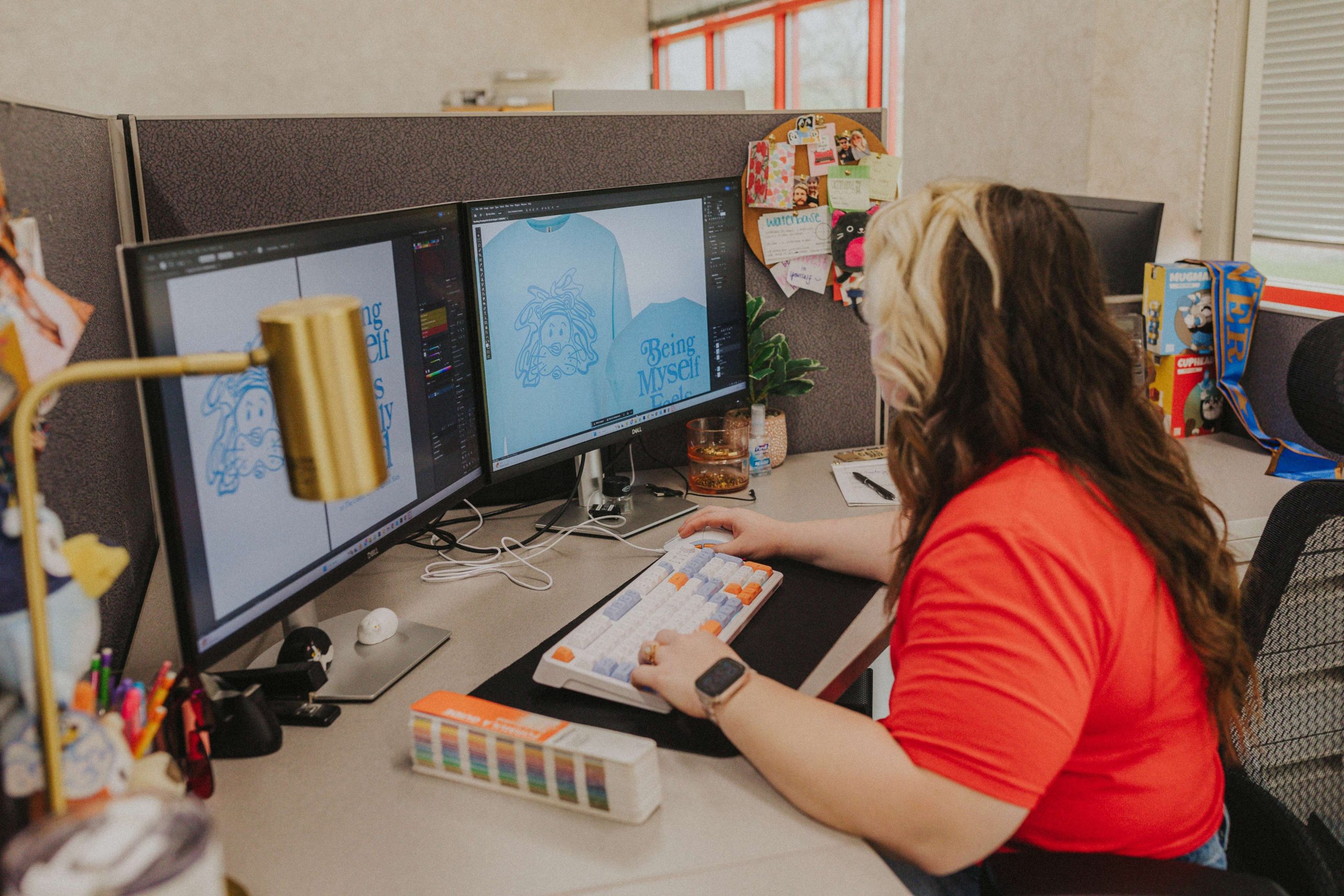
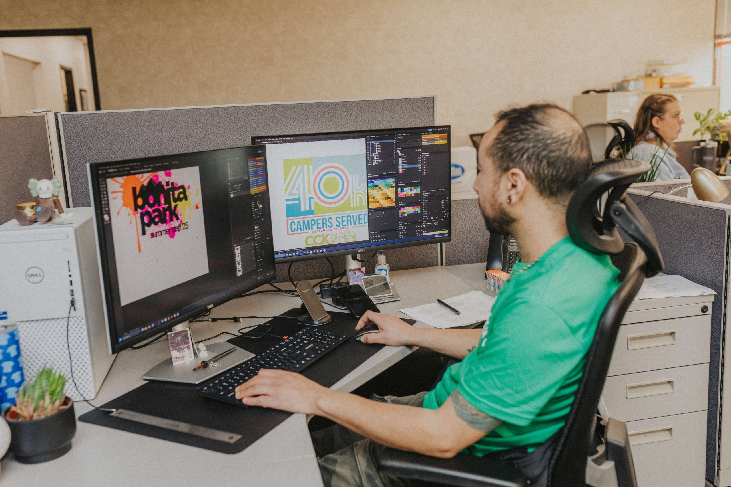
We see thousands of logos come through our art department, whether they’re headed for printing or embroidery. Some of them cause no issues at all, while some others need a little attention.
The issue usually isn’t bad art; even beautiful, expensive, agency-built logos can raise a few flags when it comes to print or embroidery compatibility. The issue is whether the logo was actually designed with printing and/or stitching in mind. If the colors aren’t right or the logo is too complex, it simply won’t print all that well.
Why? Most modern logos are designed by someone who’s thinking about how it will look on the website. Because digital displays can render anything with high fidelity, designers can take advantage of unlimited colors, gradients, and pixel-perfect precision. But print and embroidery aren’t nearly as forgiving — ink types, thread thickness, screen mesh counts, and fabric stretch are all factors that need to be taken into account when putting a logo on custom apparel.
Knowing the rules ahead of time can make sure your logo looks as clean and crisp in person as it does on the screen. So, let’s go over some practical steps for making your logo ready for custom printing, whether you’re spinning up a brand from scratch or adapting a design you already have.
Lock In Your Colors with Pantone
One of the biggest differences between digital design and physical production is color. Screens use light to display color, while printing uses ink, which is why colors look different in print than they do on your monitor.
Using Pantone colors can resolve this issue. Pantone is a standardized color system used in printing, where each color has a specific code, and that code allows different print shops to reproduce the exact same color consistently.
For example, if your brand guide specifies “PMS 286 C” for a deep blue, printers can accurately match that color across different production runs and vendors.
What to do: When you’re building or updating your brand guide, pick Pantone equivalents for every brand color. If you already have a logo and no Pantone callouts, ask your designer to add them, or send us the artwork and we’ll help match it.
Keep the Color Count Small
As a good rule of thumb, fewer colors equals lower cost, faster turnaround, and a design that holds up at any scale.
This is especially true in screen printing, where every color in your logo requires a separate screen that has to be manually set up. If you’ve ever tried to start a screen printing order with 10+ colors only to be shocked by the price, this is why.
What to do: Reduce the complexity of your printed design to just a handful of colors. The industry rule of thumb is ten colors or fewer, but most great merch logos live between one and four. If your current logo has an intricate design with fifteen different colors, ask your designer for a simplified print version.
Remember the 1/4″ Rule in Embroidery
Embroidery has physical limitations that can further restrict creativity in custom apparel. The reason is simple: Thread has thickness, and stitches can only be made so small. If the text is too small, the letters start to blend together and details disappear. The openings inside letters like Os and As can fill in with thread, making the design impossible to read from three feet away.
That’s why any text intended for embroidery should be at least 1/4″ tall, with some thinner fonts needing to be a touch bigger. Script fonts with delicate flourishes should either be quite large or simplified.
Screen printing handles small text better than embroidery does, but it still has limits. We can hold tiny text on a high-mesh screen with the right setup, but the smaller you go, the harder it is to consistently print details.
What to do: Open your logo file and measure the smallest text. If it’s under a quarter inch at the size you plan to print, make the text larger or drop it from the merch version of the logo. A tagline that reads well on a business card can often be abbreviated from the merch version of the logo.
Eliminate Gradients and Shading in Embroidery
Gradients, those smooth transitions from one color to another, are not great for embroidery.
In embroidery, there’s no such thing as a gradient; there’s only one thread color at a time. Skilled digitizers can fake a gradient by blending two thread colors with a stitch pattern, but the result is approximate at best and won’t look like the smooth blend in the original.
Screen printing is a different story — it’s tricky, but possible. In screen printing, gradients have to be converted into halftones: tiny dots that trick your eye into seeing a smooth blend. These can look incredible in expert hands, but they’re sensitive and demand the right mesh count, emulsion, squeegee, and pressure. If any of those are off, the gradient prints muddy or banded. You see this a lot with less experienced or poorly equipped printers, but at BlueCotton, we’ve dialed in those factors to provide beautiful prints despite the technical demands.
Shading runs into the same wall. Drop shadows, soft glows, and faded edges are all forms of partial transparency, which most printing methods cannot reproduce very well.
What to do: For embroidery, simplify gradients to solid colors — a two-tone logo with a clear line between the colors will outperform a gradient.
Reduce Fine Details
A thin pinstripe in a logo may look perfectly sharp on screen, but fabric printing has physical limits that digital design doesn’t. Ink spreads slightly as it transfers onto fabric, and textured materials like cotton blends or heathered garments can soften or interrupt very small details. That’s why lines that appear crisp digitally can print thicker, lose definition, or disappear at smaller sizes.
This becomes more noticeable with hairline strokes, intricate filigree, dense textures, and tightly spaced elements. Fine details also tend to lose clarity when artwork is scaled down for common placements like left-chest prints or embroidered logos.
What to do: Look at the thinnest and most detailed parts of your logo. If the lines are extremely thin, consider thickening them slightly for print applications. Simplifying very intricate details can also improve clarity and consistency on the fabric. A good test is to shrink the logo to its intended print size and view it from a few feet away. If any important details disappear or get muddy, they’re probably too fine for the application.
Think About Where the Design Will Go on the Shirt
Where you want your branding printed can end up affecting the design itself.
For full front or full back designs, center the design horizontally. Vertically, the top of the print typically will sit about 3″ below the shirt’s collar for adult sizes. This is the spot for big, bold designs for school tees, company merch, or the front of a uniform. There’s a lot of real estate here, but more isn’t always better; a design with a little breathing room around it reads as intentional, while one that fills every available inch can look heavy.
For designs on the left/right chest: This is the spot for a clean, professional logo placement. Think company polos, corporate event tees, anything where you want a subtle, branded look. We position left-chest designs 4″ to the right of the shirt’s center for adult sizes, and 3″ to the right of center for youth sizes. The design can be anywhere from 3″ to 4.5″ wide.
For sleeve designs, these tend to work best for short bits of text, small icons, or hashtag-style callouts. Keep the design no wider than about 2.5” to 3.5” so it fits comfortably on adult and small sizes alike.
What to do: Consider carefully where your branding will work best. Don’t feel like you have to take advantage of every printing spot; in some cases, simpler is better. Also, leave room for a little margin around the artwork. Designs that sit comfortably within the printable area rather than pushing it to its limits look better visually and print more reliably.
Use the Right File Format
Without getting too deep into it, the kinds of images you’re familiar with typically aren’t the kind you’d want to print. You’re probably used to seeing raster images (such as PNGs and JPGs), which can be anything from a photograph to many kinds of digital art. They’re pixel-based and inflexible; you can only zoom in so far before they start to get fuzzy because there’s a finite number of pixels in any given image.
Vector images (such as AIs and SVGs), on the other hand, are based on math. They look like art to you, but you can blow them up as much as you want and still retain perfectly sharp details, since the computer relies on complex algorithms to calculate and redraw the shape.
What to do: Use vector images if at all possible. If you only have raster files, make sure they’re high resolution (at least 300 PPI) and have a transparent background where possible. If you have any doubts or concerns about the source files, our design team is always happy to help you out.
Use This Checklist Before Ordering
As a recap of the above, run your design through this checklist before you send it to be printed or stitched:
- Specify Pantone colors for every brand color in the logo
- Use ten colors or fewer, especially if you want to keep costs down
- Keep all text at least 1/4″ tall if you’re ordering embroidery
- Eliminate gradients and shading for embroidery; solid colors are preferred
- Thicken thin lines so they survive the press
- Use a vector file or a high-res raster as a backup
- Decide on placement before you upload: full front, left chest, sleeve, etc.
When in Doubt, Talk to Us
Designing a logo to print and stitch beautifully takes a real understanding of how ink meets fabric and thread meets stitch. If you’re still not sure whether your logo is merch-ready, send it anyway and we’ll work with you to review it.
Every BlueCotton order goes through a free review by an actual artist on our team before it prints: a person who has watched thousands of shirts come off the press and knows which logos work and which ones need a tweak. If they spot a problem, whether it’s text that won’t embroider well or a color that won’t match, they’ll flag it before it’s too late.