It’s not uncommon to hear that you’ll need a white underbase for certain designs when ordering a screen-printed shirt. However, it’s not always clear why this is a good idea.
Let’s say you pick a dark navy hoodie or a black tee, upload the design, and the mockup looks exactly right. But when the shirt arrives, you open the box to find out that the design kind of blends into the dark background of the shirt. A white underbase would have solved this problem, providing a neutral canvas for your artwork so that it prints boldly and clearly.
Now, let’s go a bit deeper into when you do and don’t want this underbase.
What Is a White Underbase?
Many screen printing inks are not fully opaque on their own. When ink goes directly onto a dark shirt, the garment color bleeds through and changes what you see. For example, a bright yellow printed straight onto black becomes muddy, light blue on navy practically disappears, and pastel tones on dark fabric can vanish almost entirely.
Bright colors on a white shirt look exactly as they should because the fabric is already acting as the base, while on a black or darker shirt, those bright colors need something to sit on that isn’t black.
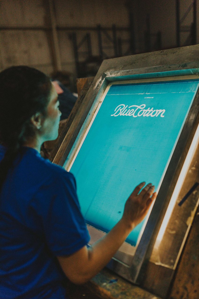
That’s where white underbases come in — essentially a layer of white ink that’s printed beneath the artwork when printing on dark garments.
Here’s how it works:
- The white underbase layer is printed first.
- The garment goes through a flash cure, which partially gels the ink with heat so it’s stable but not fully cured (this is what allows clean layering).
- The design colors are printed on top of the white base.
- The whole garment goes through a final cure, fully bonding every ink layer.
This creates a bright surface for the colors to sit on so that they appear vivid and accurate, rather than being swallowed by the color underneath. You’re effectively printing your design on white ink rather than directly on dyed fabric. Think of it like priming a dark wall before painting it a lighter color — skip the primer, and you’re fighting really hard to compete with the base color of the wall.
This is also why the same design can look more vivid on a black shirt than on a light gray one. The dark garment with a white foundation produces an especially bright result, but on light gray and without a base, the garment color can still interact with the ink, slightly dulling the overall appearance.
Sometimes, the underbase is intentionally left out for a translucent, faded effect where the fabric color shows through the print. The result is a worn, vintage feel where the colors are muted, the print feels lighter, and the design looks like it’s been washed a hundred times before you even put it on. If that’s what you’re going for, skipping the base can be an excellent move.
So, when is it best to use a white underbase? Here’s the short answer.
An underbase is generally needed when:
- Printing light or bright colors (pink, yellow, light blue, orange, red, etc.) on dark garments like navy or black
- Printing any color that needs to appear accurate and vibrant, rather than muted or translucent on a garment that isn’t white
An underbase is usually not needed when:
- The ink color is naturally darker than or similar to the garment color
- A tonal or washed-out aesthetic is intentional
Potential Downsides of Adding a White Underbase

Adding this white underbase is not without its disadvantages. Whether you’re worried about thicker prints or an annoying white border, these elements are important to keep in mind when working with a printer that doesn’t account for them or warn you about them.
Thicker Shirt Feel
Because white underbases come with an additional layer of ink, prints with a strong base feel more substantial in your hand. Especially on large graphics with heavy coverage, you might notice the print feels denser or smoother compared to a lighter print on a white shirt.
Printers can soften this feel somewhat by adjusting the underbase formula or by using higher mesh screens to deposit a thinner layer of ink. But there’s always a tradeoff between brightness, softness, and the demands of the design itself. The more vibrant and color-accurate you need the print to be on a dark garment, the more ink coverage it typically takes to get there, which is why a large, detailed design with multiple bright colors on a black hoodie will always have more ink presence than a simple two-color logo on a white tee.
The White-Edge Problem
One issue that can show up on dark garment prints is a thin white halo around the artwork edges. This happens when the underbase is slightly larger than the top color layers and visible around them, usually due to minor misregistration on the press.
Professional printers deal with this by choking the underbase (by about 0.5pt) and shrinking it inward slightly. This way, the top colors extend past the edge of the white base and fully cover it, so even a small amount of press shift doesn’t expose the white underneath.
The side effect is that very fine details, thin lines, or small text may look slightly thinner on dark garments than they do on white ones. For most designs, this is barely noticeable, but for artwork with very fine linework, it’s worth keeping in mind and discussing with the design team before the order goes to production.
The Takeaway for Custom Shirt Buyers

If you’re ordering a multi-color design on a dark garment and you want it to look the way the mockup looks, a white underbase will do most of the work behind the scenes. It’s often what separates a print that looks crisp and vibrant from one that’s faded and aged from the start.
Here’s the short version and some practical takeaways:
- If your design has bright or light colors on a dark garment, a white underbase is what makes them look right. Without it, those colors will be muted, shifted, or barely visible against the fabric.
- Expect a more substantial feel on dark garment prints with heavy coverage. That’s the underbase doing its job, not a sign of higher or lower quality.
- Very fine linework and small text behave differently on dark garments. The underbase prep process can thin out delicate details, so it’s worth reviewing those elements carefully before approving your proof.
- If you want a softer, faded, vintage feel, tell us. Reducing or skipping the underbase is often a deliberate technique, and it produces a completely different aesthetic.
Understanding why the underbase exists makes it easier to set the right expectations and ask the right questions when placing your order. It’s absolutely possible to have a crisp, vibrant print on dark garments, and that’s what the white underbase is for.