
Comfort Colors shirts look great out of the box. They’re soft and lived-in, and they don’t look brand-new in a way that feels stiff or shiny.
But pigment-dyed garments don’t behave like standard tees. After a few washes, some colors settle in beautifully. Others shift tone, soften contrast, or make prints feel different than expected.
We’ve seen how these shirts age in the real world — after washing, printing, wearing, and reordering. So let’s steer away from colors on a screen and go over the shirts that still look right once they’ve been lived in.
At a Glance
| Shirt Style | Best Color Behavior | Printing Sweet Spot | Yellow Flags |
| CC1717 Short Sleeve Tee | Most consistent across washes | Large front prints and bold ink | Dark inks can mute on darker pigments |
| CC6030 Pocket Tee | Softens evenly and hides wear well | Left chest and back prints | Pocket limits placement |
| CC6014 Long Sleeve Tee | Deep colors age especially well | Front prints and sleeve hits | Light shades show wash character faster |
| CC4410 Long Sleeve Pocket Tee | Muted tones stay steady | Minimal chest prints | Pocket can complicate balance |
| CC9360 Tank Top | Brights and classics hold best | Front prints | Light pastels shift the fastest |
1. Comfort Colors CC1717 Pigment Dyed Short Sleeve Shirt
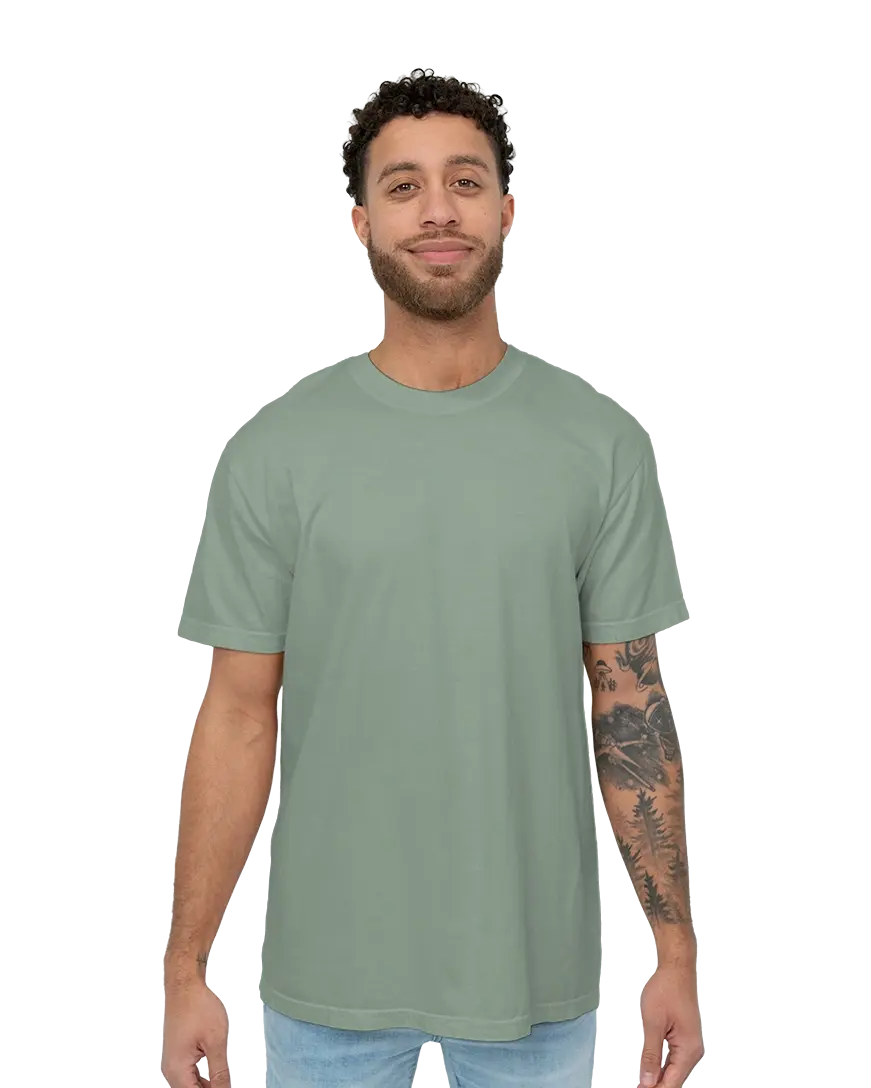
The CC1717 is the shirt most people picture when they think of Comfort Colors, and for good reason. It has enough weight to support printing without feeling stiff, and the pigment dye settles evenly over time. After a few washes, the fabric relaxes and the color softens without losing its identity.
Where this shirt really shines is in mid-tone and muted shades. Coming in 68 different colors and sizes S to 4XL, shades like Flo Blue, Blue Jean, Pepper, Chambray, and Hemp age quietly, rather than fighting the ink or suddenly looking washed out. Brighter pigments can still work, but they ask for restraint in print design. Heavy contrast inks feel bolder on day one and more vintage after a few washes.
One thing teams don’t expect with the CC1717 is how reorders feel. The shirt itself stays consistent, but pigment dye means colors like Flo Blue or Pepper can land slightly lighter or darker depending on the batch. It’s not dramatic, but it’s visible if you line new shirts up next to old ones. Most groups are fine with this because the difference feels like it’s natural wear rather than a mistake.
Where issues pop up is when the original print relies on very high contrast. Subtle designs age really well, whereas sharp black-on-light combos tend to soften faster — which can be a feature or a frustration, depending on your expectations.
Pros
- Consistent wash behavior across most colors
- Holds large prints well
- Feels intentional even after heavy wear
Cons
- Very light shades show wash variation sooner
- Dark inks can soften faster on darker pigments
2. Comfort Colors CC6030 Short Sleeve Pocket Tee
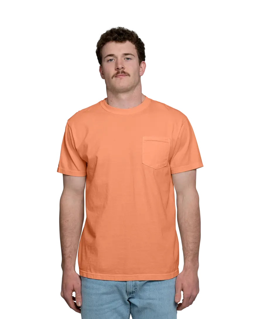
The CC6030 shirt has the same lived-in feel as the 1717, but the pocket introduces structure and limits. That’s not a bad thing; it just means the shirt works best when the design respects the pocket instead of fighting it. In reality, this is a favorite for groups that want something wearable beyond the event. The pocket helps the shirt feel like a real piece of clothing, not just a branded tee.
Muted, dusty colors do especially well here. Pepper, Grey, Blue Jean, Denim, and Seafoam keep their tone after washing, and small prints don’t feel overwhelmed by the garment.
But the pocket tee adds another layer to color decisions: balance. Pigment-dyed shades already have visual texture, and the pocket draws the eye whether you print on it or not. Colors with too much movement, very light pastels, or heavily washed brights can make the shirt feel busy once washed. Meanwhile, muted shades calm everything down and let the pocket feel intentional instead of distracting.
This is also a shirt where back prints tend to outperform front prints over time. As the fabric softens, the back stays flatter longer, which keeps larger designs feeling stable even as the shirt relaxes.
Pros
- Pocket helps hide minor wear over time
- Muted colors age very evenly
- Easy to wear casually after the event
Cons
- Pocket limits left-chest placement
- Busy designs feel crowded faster
3. Comfort Colors CC6014 Garment Dyed Long-Sleeve T-Shirt
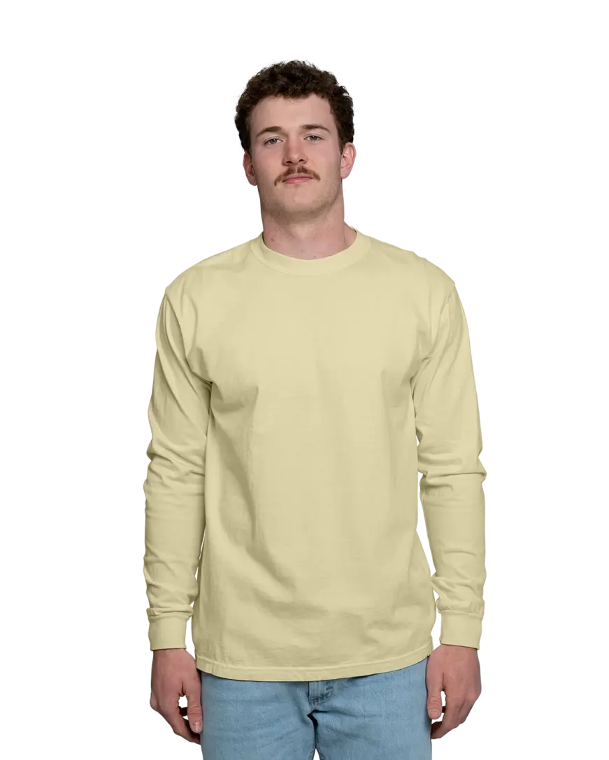
The CC6014 carries color more deeply, especially in darker or earth-toned shades. Crimson, Pepper, Denim, Hemp, and Island Reef hold their saturation better than lighter pastels once washing starts. Sleeve prints work particularly well here: The fabric has enough structure that ink doesn’t feel like it’s floating, and the lived-in texture actually helps prints feel intentional instead of sharp.
However, the pigment dye will show faster than you might expect, as sleeves twist and cuffs take friction (especially in the wash). The CC6014 handles this well in darker or earth-toned colors because the variation reads as texture, not wear. Sleeve prints benefit from this too.
As the fabric softens, the ink doesn’t feel like it’s drifting or breaking up… it just settles in. Where teams sometimes misjudge this shirt is with very light colors and dense sleeve prints. Here, the contrast can soften unevenly — which isn’t wrong, but it needs to be expected going in.
Pros
- Deep colors stay rich after washing
- Sleeve prints feel natural
- Comfortable weight for year-round wear
Cons
- Light shades show wash character faster
- Slightly heavier feel for warm climates
4. Comfort Colors CC4410 Long Sleeve Pocket T-Shirt
Between the pocket and the long sleeves, the CC4410 shirt already has visual weight, so minimal designs and calm color choices work best here.
Colors like Brick, Chambray, Flo Blue, Pepper, and Violet soften evenly and don’t compete with the pocket placement. High-contrast inks can start to feel busy once the shirt breaks in, especially after repeated washing.
However, this is a strong option for staff shirts or groups that care about consistency across reorders. It also tends to become a true everyday piece, where people wear it casually. Of course, this means it gets washed often, but when the color choice is right, that wear shows up as character, not decline.
Pros
- Structure helps prints age quietly
- Pocket adds wearability
- Good consistency across batches
Cons
- Limited logo placement options
- Overdesigned prints feel heavy
5. Comfort Colors CC9360 Pigment Dyed Tank Top
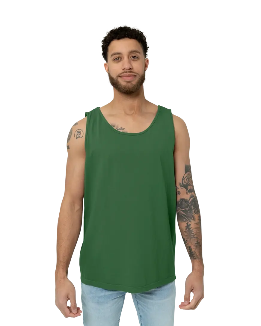
Tank tops are less forgiving. With less fabric and no sleeves, every color shift and print choice shows up faster.
That’s why the CC9360 tank behaves best in classic or saturated shades like Black, Flo Blue, Crimson, Denim, and Pepper, where pigment settling reads as character rather than wear. Very light pastels and neons tend to shift sooner once washing begins, which can feel inconsistent over time.
Printing matters more here too. Heavy ink can change how the tank hangs after a few washes, while lighter, breathable prints tend to age better and keep the shirt feeling wearable instead of stiff.
This makes the CC9360 a strong option for summer events, as long as color and print choices are made with real wear in mind.
Pros
- Bright classics stay recognizable
- Lightweight but still substantial
- Great for warm-weather use
Cons
- Light pigments shift fastest
- Less room for complex designs
How Comfort Colors Change After Washing
Comfort Colors aren’t supposed to look crisp forever. Washing softens the shirt and gently relaxes the color; that’s the charm, but it also means contrast, ink density, and shade selection matter more.
The mistake teams make is expecting the shirt to look the same after 10 washes as it did on day one. The better approach is picking colors that still feel intentional once that change happens.
FAQs
Question: Do Comfort Colors shirts fade after washing?
Answer: They don’t fade in the traditional sense, but pigment-dyed colors do soften over time. This gives the shirt a worn-in look rather than a washed-out one.
Question: Which Comfort Colors shades age the best?
Answer: Mid-tones and muted colors like Flo Blue, Pepper, Denim, Blue Jean, and Hemp tend to stay the most consistent after repeated washing.
Question: Does screen printing last on Comfort Colors shirts?
Answer: Yes, but ink contrast changes slightly as the fabric softens. Bold prints stay readable, while very fine details can feel more subtle over time.
Question: Are Comfort Colors good for reorders?
Answer: They can be, as long as you expect slight variation. Pigment dye naturally introduces small shifts between batches, especially on lighter shades.
Question: Do light Comfort Colors fade faster than dark ones?
Answer: They don’t fade, but light pigment-dyed colors change sooner. Pastels and pale shades soften and shift tone faster after washing, which can reduce print contrast over time. Darker and mid-tone Comfort Colors keep prints readable and the shirt looking intentional longer.
Picking Colors That Still Feel Right Later
When it comes to Comfort Colors, pick shades that look good when they soften. Choose designs that don’t rely on razor-sharp contrast. And remember that the shirt people keep wearing is the one that feels natural after a few months, not just impressive on delivery day.
If you want shirts that still look intentional once they’ve been washed, worn, and reordered, the options above are where we’d start — and where we usually end up after watching everything else play out.