When it comes to custom screen-printed apparel, ink color selection is one of those decisions that feels simple on the surface but has more going on underneath. The choices you make here affect the final look, the cost of your order, and how closely the finished shirts match your brand.
Here’s what’s worth knowing about choosing ink colors for screen printing before you finalize your artwork.
Why More Colors Means Higher Cost
Before you decide on which colors to use, it’s worth deciding how many.
In screen printing, every color in your design requires a separate screen. Each screen needs to be produced and aligned on the press before printing, and the extra time and money it takes to assemble the print quickly show up in your order total.
| Colors in Design | Relative Cost | Good For: |
| 1 | $$ | Great for simple logos, text-based designs |
| 2 | $$ | Covers most athletic and organizational needs |
| 3–4 | $$$ | Manageable, common for event shirts |
| 5+ | $$$$ | Good for premium merch & keepsakes |
| 10+ | $$$$$ | Rarely necessary in SP, consider DTF instead |
In some cases, these limitations also work in your favor. Oftentimes, a two-color design with strong contrast can have more visual impact than a five-color design that’s confusing to the eye.
Stock Colors vs. Custom Mixed Inks (Pantones)
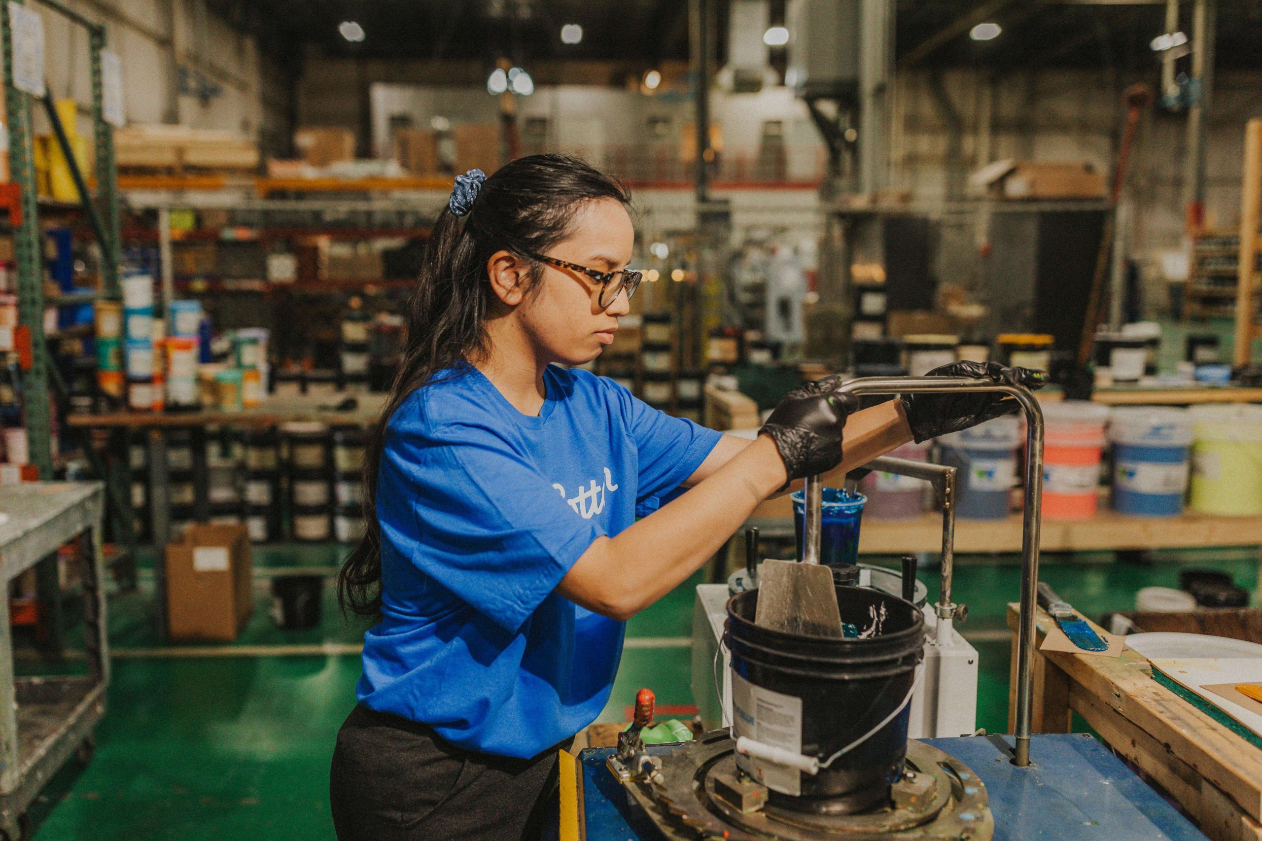
Most screen printers maintain a variety of stock inks on hand. These are pre-mixed colors that cover the most common customer needs, and they’re ready to go without any additional setup. At BlueCotton, our most-used stock colors include: black, white, red (PMS 200), royal (PMS 286), athletic gold, purple, orange, navy, charity pink, and green.
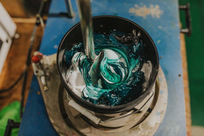
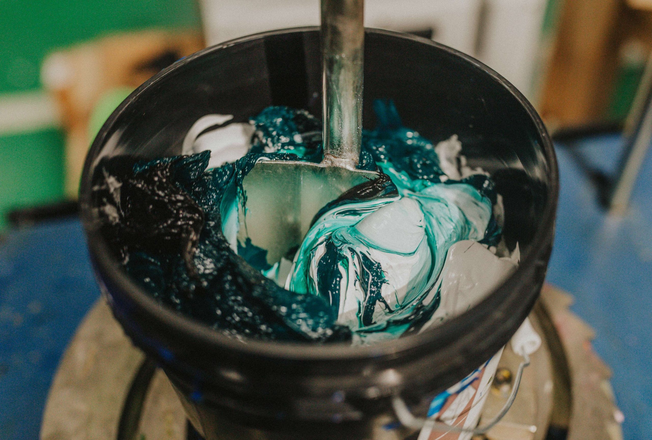
If your design calls for a color that isn’t close enough to a stock option, that’s when custom ink mixing comes into play. Blending inks to hit a specific target color adds a step to production, but for orders where brand accuracy matters, it’s the right call.
The target color is usually under the Pantone umbrella — a standardized color matching system used across the printing industry. Under the Pantone library, each color has a specific numerical code, and that code translates to the same color regardless of where or when it’s printed. So if your brand guide specifies “PMS 286 C” for your blue, a printer using the Pantone system can reproduce that exact blue consistently, whether it’s the first order or the fifteenth. Without a Pantone reference, you’re matching by eye or monitor, and screens vary too much to be reliable.
Use custom mixed inks when:
- Your brand has documented Pantone colors that need to stay consistent across products and future orders
- You’re ordering for a corporate team or event with strict brand guidelines
- The design calls for a color noticeably different from any stock option (a dusty sage, a specific teal, an unusual orange)
- You’ve had color inconsistency issues with previous printers
Stock inks are probably fine when:
- The design uses common athletic or primary colors
- The garment color is the main visual element and ink color is secondary
- It’s a one-time run where consistency across future orders doesn’t matter
- You don’t have a formal brand guide and approximate color matching is acceptable
How Garment Color Affects Ink Color Choices
The color of the shirt itself is also part of your color palette and influences the final look of the design.
As a general rule of thumb, if you want your design to pop and stand out, choose a high-contrast color from the color of the shirt. Printing a color that’s close to the garment color (like a charcoal design on a black shirt) is a stylistic choice that reads as intentional and premium when done well, but if it’s not what you’re going for, it will look odd.
Also keep in mind that if you want to print light ink on a dark fabric, you’ll need to ensure your printer uses a white underbase. This is an additional layer of white ink printed first to give the top colors something opaque to sit on — without it, dark fabric bleeds through and mutes the ink. It’s not required if you’re intentionally going for a vintage, faded look, but if you want the design to be bold and clear, you’ll need a base.
You should also always look at a mockup of the actual garment before approving. A design that looks great in isolation can look completely different once the garment color enters the picture.
Final Thoughts & Things to Keep in Mind
Here’s a quick guide of what you should know when ordering custom apparel, specifically when it comes to color:
- Cost differs based on the number of colors. Each ink color requires a separate screen. Keeping the color count between one and four is the most cost-effective range for screen printing, and simpler designs often have more visual impact anyway.
- Stock colors cover most orders. For designs using common athletic or primary colors, our stock palette will get you there without any additional setup. Black, white, red, royal, navy, athletic gold, and a handful of others handle the majority of what customers need.
- Pantone numbers are more reliable than digital files alone. If exact color-matching is important, provide your Pantone color codes when you place your order. If you don’t know your Pantone equivalents, the art team can help identify them.
- The garment color is part of the design. Consider how the colors in your design look against the color of the shirt. Do they go well together? Is there enough contrast? Always review the mockup based on the actual color of the garment.
- Fewer colors can have more impact. A bold two-color design with strong contrast often reads better on a shirt than a five-color design with competing elements. This holds especially true at the distances people actually view the shirts from.
- When in doubt, reach out. If you have any questions about how the colors will come out on the shirt of your choice or if you just aren’t sure about something, our experienced design team is here to help walk you through any decisions before placing your order for print.
As a final note, every BlueCotton order includes an artist review before production starts. Our team checks your artwork for color accuracy and print compatibility, and if something looks off, we’ll flag it before anything goes to press.