Summer camp shirts have a lot of jobs to do. They need to be fun enough for kids to get excited about, practical enough for a week of activities, and distinctive enough that counselors can tell one group from another at a glance.
For camp directors and program coordinators, there’s also the question of how much information to put on the shirt: Age groups, session names, camp logos, years, cabin groups, and staff roles can all find their way into the design.
That doesn’t mean a camp shirt needs a complicated illustration or a dozen colors to feel special, though. Some of the best designs use one recognizable image, a memorable phrase, or a simple graphic system that can be adjusted from year to year. Lately, a lot of camp shirts take their cues from the past, with vintage-style graphics, nature illustrations, bold lettering, and hand-drawn art paired with warm colors and classic outdoor imagery.
If you’re stuck on the design for your next shirt, here are some summer camp T-shirt ideas to consider.
1. Give the Camp a Vintage Badge
A badge-style design is a classic camp choice because it brings the camp’s name and setting together in one graphic. This style works especially well for established camps that want their shirts to feel connected from one summer to the next.
If your camp already has an emblem or logo, you can build the design around it. If not, a circular or shield-shaped badge can pair the camp name with details from its surroundings, like a mountain, lake, canoe, pine tree, or campfire.
An unusual typeface, a limited color palette, or a hand-drawn illustration can give the badge its own personality, and adding the camp’s founding year gives it a sense of history.
2. Turn the Camp Location into the Artwork
If there’s something distinctive about where your camp is located, it can make a great starting point for the shirt design. A lake, mountain range, or other recognizable landmark could be the main focus, or you might feature a favorite building, dock, bridge, climbing wall, or trail that campers will recognize instantly.
3. Design Around One Memorable Camp Object
The location doesn’t have to be the focus. Sometimes, a single object is so closely tied to camp that it deserves to be the star of the shirt. This makes the shirt feel specific to your camp instead of looking like another generic outdoor graphic.
Maybe it’s the bell that’s been calling campers to dinner for 60 years, the canoe everyone swears is haunted, a legendary tree that kids love to gather under, or a snack campers are obsessed with. If there’s already an inside joke surrounding it, even better.
4. Try a Hand-Drawn Illustration
A hand-drawn illustration can give any of these ideas a more personal feel. You could turn the camp location into a loose sketch, draw a memorable object in an exaggerated style, or combine several smaller camp details into one illustration. The artwork doesn’t need to look perfectly polished — slightly uneven lines and playful details make the shirt feel like it was made for your camp specifically.
Hand-drawn art can also be extremely simple. A single-color line drawing of a tent, canoe, mountain, or cabin gives the shirt a clean, modern look, with the camp name underneath or worked into the drawing. That style has more of an outdoor-shop feel than a typical camp tee, so it’s a good choice if you want a shirt people will wear outside of camp.
Either approach is especially fitting for arts programs or smaller camps that want their shirts to have a handmade quality.
5. Go Retro with a Big Camp Name
You don’t always need an illustration. The camp name, location, and year can be enough when the typography does the work. Try the camp name in large block letters, curved text, a vintage athletic typeface, or a slightly funky ’70s-inspired font, and arrange the smaller details around it.
If the design needs a little more, a small sun, stars, trees, or waves can fill it out.
6. Color-Code Age Groups and Sessions
Color can be an easy way to organize a large camp program. Younger campers could get bright yellow shirts, middle schoolers blue, and older campers green. The same system works for sessions, cabins, or program tracks, and it makes groups easier to spot during activities and field trips.
The artwork can stay the same while the shirt color changes, which saves you from creating several different designs. If your camp runs multiple sessions, you could also keep one shared design and add that small detail for each group. As a bonus, campers who attend more than one session get to collect each version.
Before settling on colors, check the available shades across your full size range, since some colors aren’t offered in every size.
7. Make the Year Part of the Design
A camp shirt is a souvenir of a particular summer, so give the year a visible spot in the artwork. Instead of a tiny “2027” under the logo, try a large “Summer 2027,” put the year inside a badge, or build the whole graphic around the numbers.
This also makes it easy to balance consistency and change. Keep the core camp logo the same every year, and let the year, colors, illustration, or theme shift around it. Over time, the shirts become a visual history of the camp without anyone wearing the same design twice.
8. Create a Camp Mascot

A mascot can give you a design system that lasts for years. It could be a bear, frog, raccoon, owl, or an entirely made-up creature.
The fun part is giving the character some personality. One summer, the mascot could be hiking; the next, it might be tipping out of a canoe or roasting a very burnt marshmallow. You keep a recognizable character while giving the shirt a fresh look each year. Younger campers may enjoy a more expressive illustration, while older campers might prefer a simpler mascot emblem.
9. Make It Look Like a Camp Souvenir
Instead of treating the shirt as program apparel, design it like something you’d find in a camp store. A small logo on the front with a larger illustration on the back works well, or you could use a big vintage-style graphic on the front that feels like a souvenir from a specific place and summer.
Subtle branding and simple illustrations make this an especially good fit for teen campers and counselors, who may want something that feels more like regular clothing.
10. Give Counselors Their Own Version
Staff shirts don’t have to look completely different from camper shirts. You could use the same artwork and change one element, like adding “Staff” across the back, putting “Counselor” under the camp name, or switching to a different shirt color.
That keeps the camp looking unified while making counselors easy to find. For larger camps with several staff roles, different colors can also help campers tell counselors, activity leaders, and other staff apart.
11. Make a Shirt for a Camp Tradition
Some camp events are big enough to deserve their own shirt, whether it’s a talent show, canoe races, an annual hike, or the big end-of-week campfire. The shirt could feature the event name, a graphic tied to the activity, or an illustration that becomes associated with that year’s event, with the main camp logo kept small.
If the event happens every year, a new design gives campers something to look forward to.
12. Keep the Color Palette Simple
More colors don’t necessarily make a camp shirt more interesting. A two-color design can have plenty of impact when the artwork is strong. Try combinations that fit the camp’s setting, like cream and forest green, navy and light blue, or orange and brown. A single color can work especially well with line art or bold typography.
A limited palette also makes a large order easier. When you’re printing shirts for hundreds of campers, a one- or two-color screen print keeps the artwork easy to reproduce and the cost more manageable.
Tips for Success
Once the design is settled, a few practical details will help your camp order go smoothly:
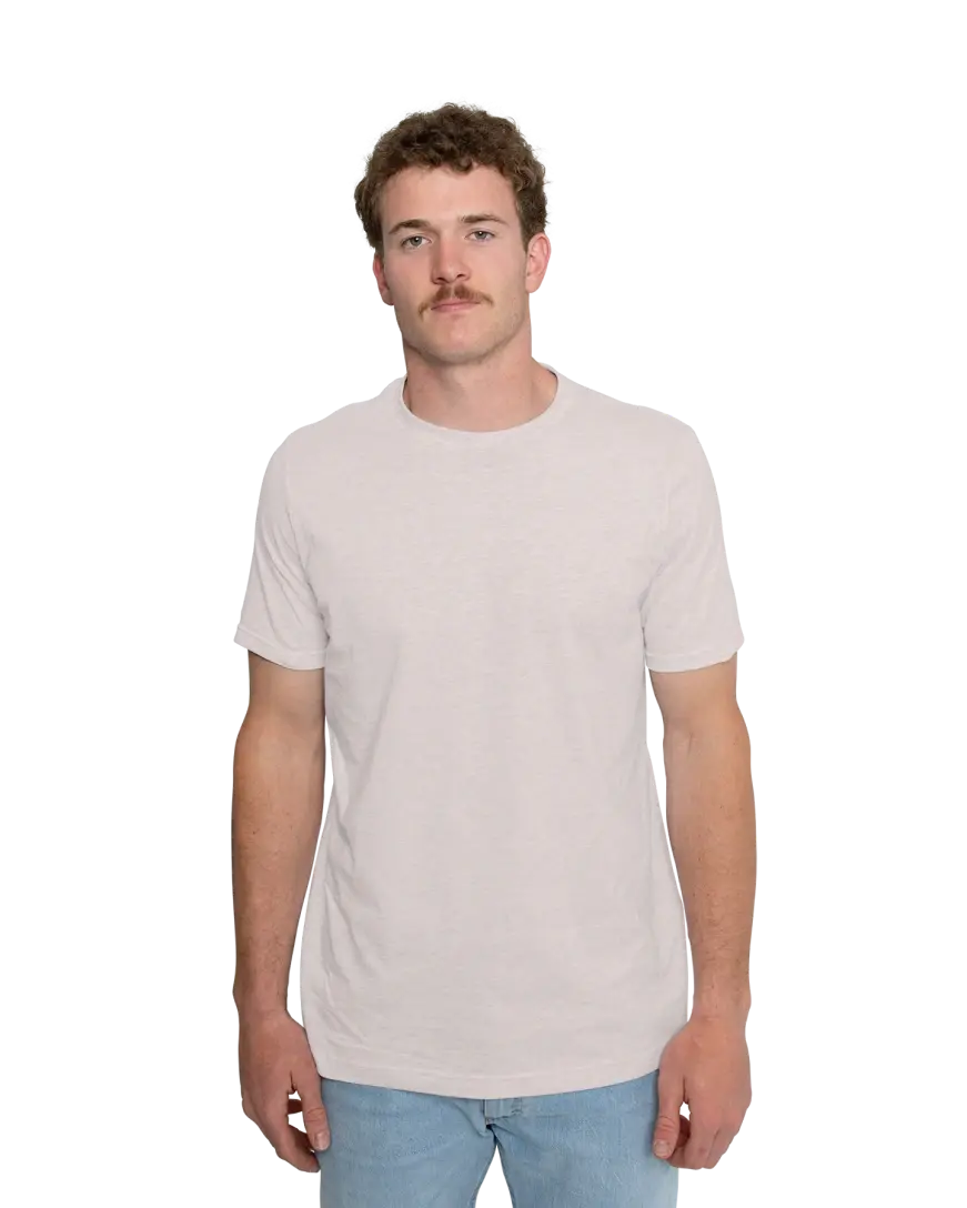
- Pick a shirt that can handle camp life: Campers will wear these outdoors, during activities, and through plenty of washing. For hot-weather programs, a lighter shirt will be more comfortable on active days. Performance or moisture-wicking shirts can be a good fit for staff who spend long hours outside or for especially active programs. For campers, softness and a comfortable fit go a long way.
- Check your artwork at shirt size: A detailed illustration may look great on a screen, but small details can disappear when a design is scaled down, and thin lines can be hard to print cleanly. Bold shapes and readable lettering hold up best.
- Confirm sizes for everyone: Camps usually need a wide range of youth and adult sizes, so make sure your shirt and color come in all of them before finalizing the order.
- Start from a template: Our summer camp design templates let you pick a design, change the colors, and customize it for your camp. You’ll also find more templates and a library of clip art in our Design Studio.
Every summer at camp is a little different, and a good shirt captures what made this one worth remembering. Pick one strong idea, tie it to something campers will recognize, and let the details change from year to year. Do that, and it could become the shirt a camper keeps reaching for all through the school year.