Most people who place a custom T-shirt order with us aren’t professional designers. They’re a small business owner who needs staff shirts, a volunteer organizing a charity 5K, or a team manager putting together apparel for a season opener.
The good news is that designing a T-shirt doesn’t require an art background. It’s easier now more than ever before, thanks to modern design tools that do a lot of the work for you. However, it does help to understand a few things about how your artwork translates to ink on fabric, along with some fundamental best practices.
Have One Focal Point, Not Many
The most common mistake in T-shirt design is trying to include too much. A logo, a tagline, a website URL, the founding year, a list of sponsors, and an illustration all competing for the same space make the design crowded. This results in a shirt where the eye has nowhere to land.
An effective T-shirt design has one thing that anchors it, with everything else supporting that element.
Ask yourself what the one thing is that someone should take away from this shirt. Your brand name? The event? The team? Lead with that. If something else could be removed without the design feeling incomplete, remove it.
Remember the Six-Foot Rule
A good way to approach your design is to think about how the shirt will look when you step back and look at it from a normal distance — keeping in mind that people will rarely lean in to read every detail on a shirt.
Details that are too fine can sometimes be risky in print. Small text, thin lines, delicate linework, and tight lettering all require a level of precision that can be difficult to reproduce consistently at production scale. In some cases, these details may even appear softer or less defined in the final print than they do in the on-screen mockup.
Can someone understand the message from about six feet away? If not, you might need to make some changes. Usually, this means either the font size, the color contrast, or the amount of information crammed into the space.
Keep Your Font Count to Two
Typography is another important thing that can significantly influence the look of a T-shirt design. Too many different fonts in different sizes and styles all fighting against each other creates visual noise that can’t be fixed with clever placement.
In general, a max of two fonts that complement each other is more than enough. A common pairing is a strong font for the main message alongside a simpler one for supporting text. One establishes the brand, while the other maintains legibility.
Font weight and size are also important. Text that’s too thin can be a liability, as fine strokes may not hold cleanly depending on the printing method (especially in smaller sizes). Bold or semi-bold weights, on the other hand, tend to survive the press more reliably. Keep the smallest font at least ¼ inches tall.
Use a Shape to Anchor Your Design
If your design has multiple elements and it feels like they’re floating independently rather than working as a unit, a tasteful background shape can solve that problem.
A simple circle, rectangle, arch, or banner behind your main design elements gives the eye a container to work within. It doesn’t have to be prominent — a subtle shape in a complementary color (or even just an outline) can tie everything together and make the design feel intentional.
This is a technique often used in athletic apparel, event shirts, and brand merch because it works for the design and is also print-friendly. A solid shape in a single color is easy to register on press, and it frames your artwork without adding complexity. Just be careful and ask for some opinions; this approach can come off tacky if not done well.
Consider Fewer Colors for Higher Impact
More colors feels like more value. But all too often, the strongest T-shirt designs are the ones that use color deliberately and sparingly. For example, a two-color design with strong contrast can be read better at a distance than a six-color design where the tones blend together.
When you’re selecting colors, think about how they’ll contrast against the color of the shirt itself. A white ink on a yellow shirt will look different than a white ink on a black shirt, after all.
Avoid designs that rely on gradients or subtle shading unless you’re using a printing method like direct-to-film (DTF), which handles continuous tones differently than screen printing. In screen printing, gradients require halftones, which add complexity and cost. If your design was built for a digital display, it may need to be simplified before it’s ready for the press.
As a plus, keeping the color count down also directly affects the cost if you’re getting a screen-printed shirt. Every additional color in a screen print is another screen that has to be set up, which means a higher price per shirt. A focused design with two or three colors will almost always look better and cost less than a cluttered one with six.
Design with Print in Mind
If you keep all of these guidelines in mind, you’ll have a better shot at nailing your design. If you’re most concerned about just a quality print and not necessarily the quality of the design, here’s a refresher of the most important tips:
- Designs with one to four colors tend to print most successfully, while jumping to six or more colors adds both cost and alignment risk.
- For text, bold type at a reasonable size is your safest bet — thin fonts and very small text can lose definition in the printing process.
- The same logic applies to the level of detail: clean edges with well-defined lines reproduce reliably, whereas fine linework and tight crosshatching can get muddy.
- Make sure your design has strong contrast against the garment color itself; tones that are too similar to each other or to the shirt tend to blend together and lose impact.
This doesn’t mean your design has to be so simple to the point of being boring. It just means designing with production in mind from the start, so what you see in the mockup is close to what actually comes off the press.
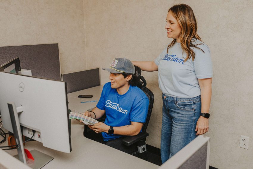
And finally, if you’re not sure that the design you have on hand is ready for print, that’s a completely normal place to be. Most people placing a custom T-shirt order with us aren’t professional designers, and that’s where we’re happy to step in and take a look.
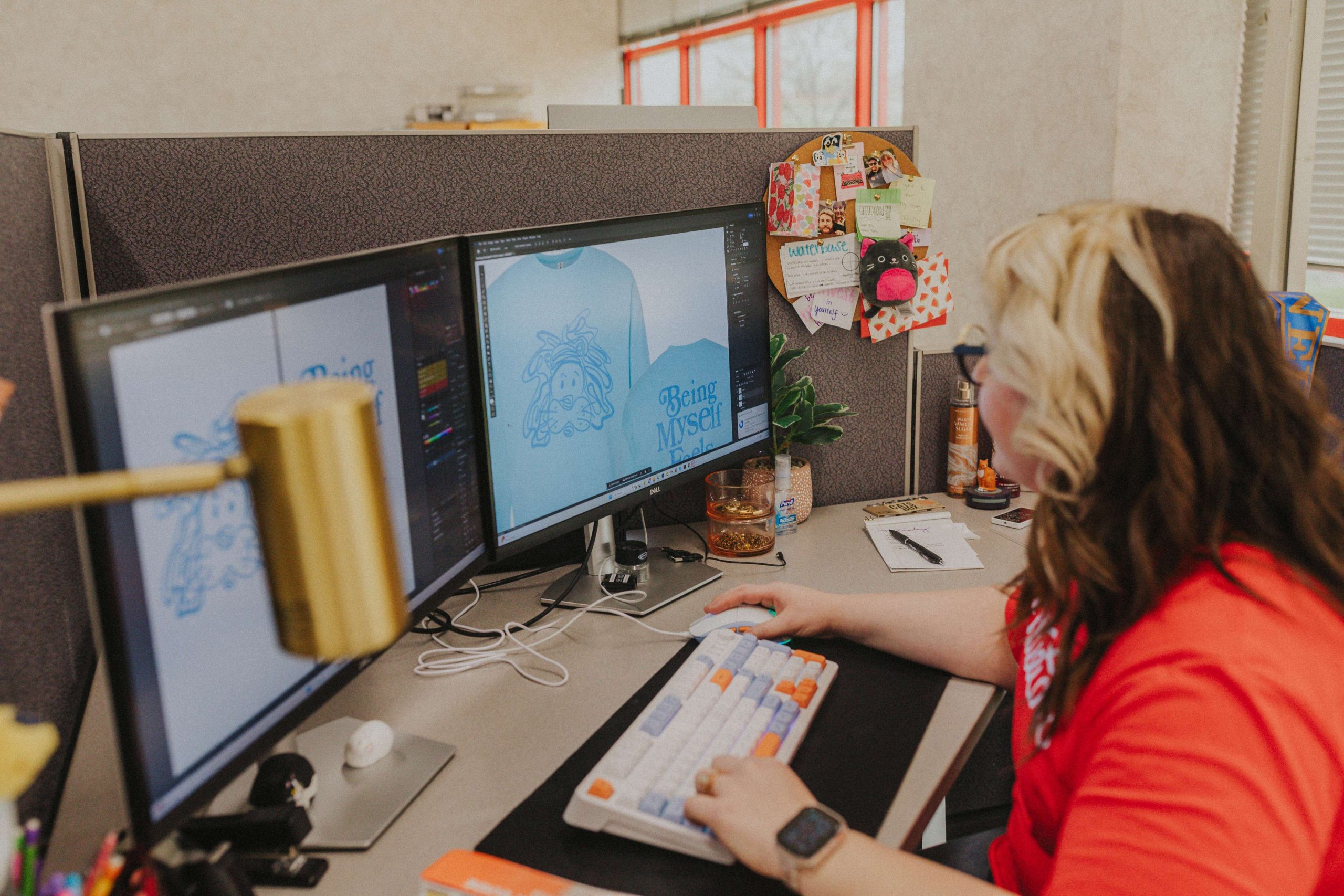
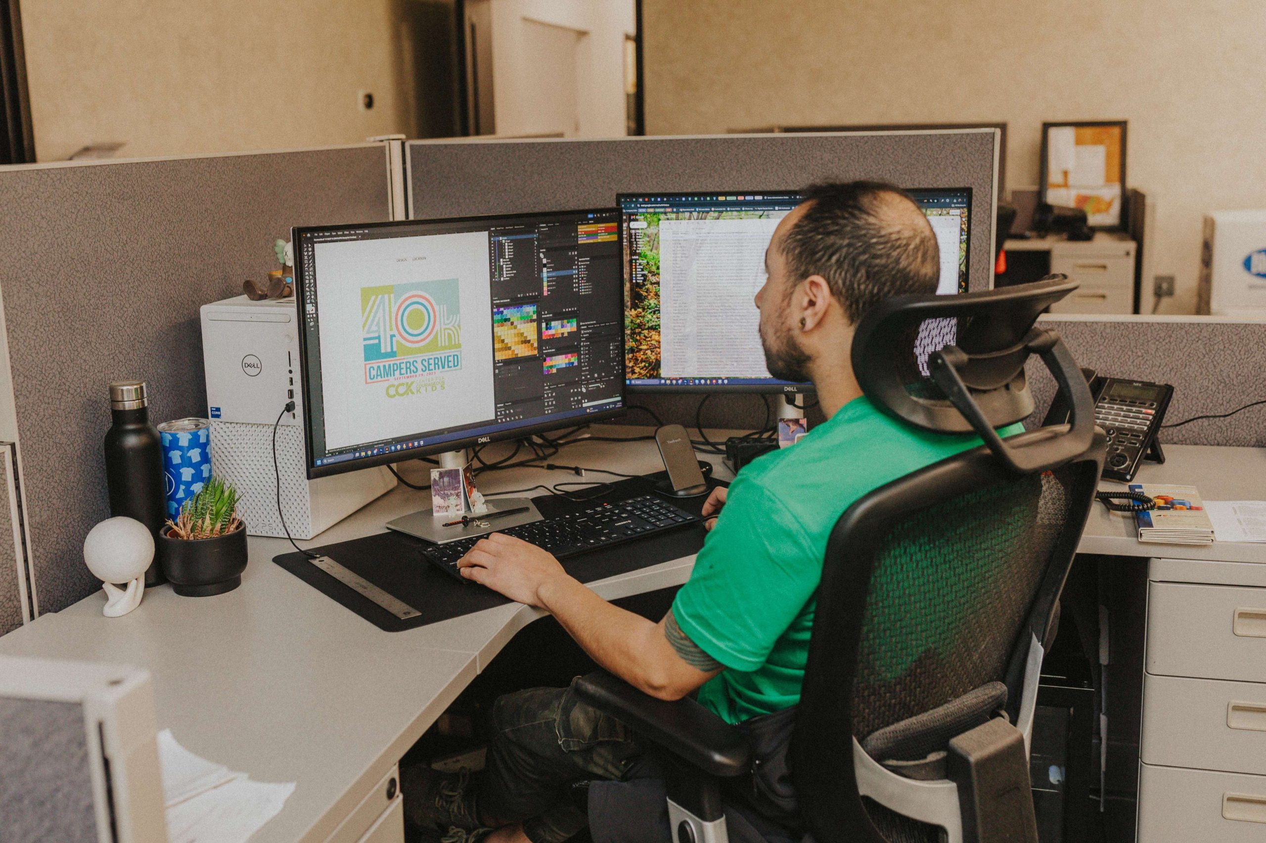
Every order you place with us includes a free design check and review by one of our artists before it goes to press. If there’s a file issue, a resolution problem, a font that’s going to cause trouble, or a color that won’t reproduce the way you’re expecting, we’ll flag it and work with you to fix it. You can also talk to us directly if you’re unsure about something or want any specific changes made to your proof.
If you’re starting from scratch and don’t have a design yet, explore our Design Studio! It includes hundreds of free templates that you can customize to create your own design — no prior design experience needed.