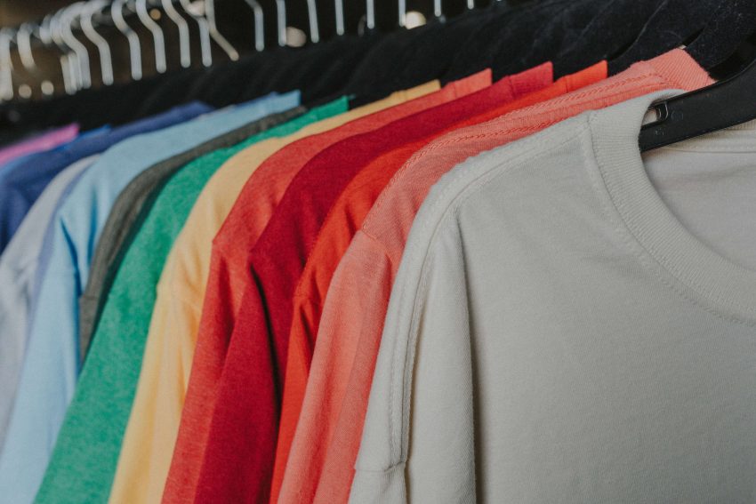
Choosing a shirt color for your next custom print might seem like a simple style choice, but it plays a much bigger role in how the finished shirts turn out.
In reality, the same design can have a noticeably different impact depending on the shirt color, fabric, and dye process behind it. For example, a logo that pops on a white tee can look softer once it’s printed on heather gray. And a detailed design that reads clearly on a light shirt can lose some definition on a dark one. Even small differences in fabric and finish can alter how a color looks once it’s actually printed.
While the wrong shirt color can muddy your design, the right shirt color will complement your artwork, the fabric, and the overall look you’re trying to create. So let’s go over some of the most important factors when choosing a shirt color for custom apparel.
The Golden Rule of Design: Contrast
One of the most important factors when choosing a shirt color for custom artwork (and design in general) is contrast — basically, how much variance there is between two elements.
When it comes to design, the most straightforward example is black text on a white background. This is easily readable from reasonable distances and has no risk of being visually confusing. A purple design on a blue shirt, on the other hand, blends together too easily and doesn’t make for a strong, clear look.
That being said, lower-contrast combinations can be effective when you want a more subtle or vintage look. A good example is a charcoal print on a heather gray shirt, which creates a softer look that’s understated but still legible. The key is balance: too little contrast is never a good move, while too much contrast might be bolder than you’re aiming for.
Where colors sit on the color wheel can help you pick combinations that feel intentional.
- Complementary colors sit directly across from each other on the wheel: e.g., orange and blue, red and green, purple and yellow. These pairings create a lot of visual energy because each color makes the other look more vivid. An orange design on a light blue shirt, a purple logo on a yellow shirt, or a red graphic on a forest green shirt are all complementary pairings that read as bold and intentional rather than clashing.
- Analogous colors sit next to each other on the wheel, like blue and green, or red and orange. These combinations feel more cohesive and easier on the eye, which makes them a good fit for a subtler, more sophisticated look. A teal design on a navy shirt is a good example, since blue and green sit right next to each other on the wheel and read as harmonious rather than high-contrast. A muted orange print on a red shirt works the same way, leaning into warm tones that sit close together instead of competing.
That being said, a complementary pairing where both colors are similarly light or dark will still look a little flat. Pairing complementary colors with a noticeable difference in brightness, like a bright orange on a deep navy, is what often creates the strongest visual impact.
So, when reviewing your design, ask:
- Can the main elements of the artwork be seen clearly from a distance?
- Do the important details stand out from the shirt color?
- Does the color combination match the mood of the design?
- Will text remain readable?
Pro tip: For designs with small details, thin lines, or text, stronger contrast is usually the safer choice. Designs with large shapes or simple graphics often have more flexibility.
How Fabric Type Affects Color Appearance
Different fabrics also have unique textures and finishes, which can subtly influence how shirt colors and printed designs appear. While these differences are often minute, they can influence how vibrant the shirt color appears and how your printed design stands out.
100% Cotton
Cotton is one of the most popular fabrics for custom screen printing because it provides an excellent surface for detailed artwork, logos, and text, producing consistent results and making it a dependable choice for everything from company uniforms to retail apparel.
Cotton fabrics typically have a matte finish that gives shirt colors a classic, even appearance. The garment color will usually look rich and consistent across the surface, creating a clean backdrop for your design.
For predictable color reproduction and a traditional screen-printed look, 100% cotton is hard to beat.
Polyester
Polyester is widely used for athletic, moisture-wicking apparel. Compared with cotton, it has a smoother feel and often a slight sheen, which can make the shirt color appear different as it catches the light.
For example, a light blue polyester performance shirt may look more vibrant outdoors than the same color on a cotton T-shirt because the fabric reflects light differently.
While the difference is subtle, the fabric finish can influence the overall character of the shirt. If you’re deciding between similar garment styles, consider whether you prefer the classic matte look of cotton or the smoother appearance of polyester. Cotton-poly blends combine the characteristics of both fibers, offering a balance of softness, durability, and performance.
Heather Styles
The most noticeable visual difference is often found in heather styles, which are created by blending fibers of different colors.
Instead of a perfectly solid background, heather shirts have subtle visual texture that gives them a relaxed, casual appearance. This textured backdrop can also soften the overall look of a printed design.
For example, a white logo printed on a heather gray shirt has a more laid-back feel than the same logo printed on a solid gray shirt.
Garment-Dyed Shirts vs. Standard-Dyed Shirts
The dye process also affects the appearance of a shirt’s color.
Shirts made from pre-dyed fabric typically have a more uniform color appearance, providing a predictable background for printing. That’s why they’re commonly used for promotional apparel, uniforms, and branded merchandise.
Garment-dyed shirts, on the other hand, are dyed after the garment has already been constructed. This creates a softer, lived-in appearance with natural variations in color, resulting in a casual and vintage feel. It’s a more relaxed, worn-in look that complements muted colors best, making it especially good for brands or groups looking for a premium, lifestyle-oriented appearance.
If your priority is exact color consistency across a large order, a standard dyed shirt may provide a more predictable result.
Choosing Shirt Colors for Brands and Teams
If you’re ordering for a one-off event, you have a lot of creative freedom to pick whatever shirt color looks best.
But team and corporate orders are a different game, since you need to make sure you’re sticking to the brand guidelines and keeping the shades consistent across orders.
Here are some tips for nailing that consistency:
- Settle on one or two go-to shirt colors for your brand, rather than picking a new shade every time.
- Note the exact product and color name you ordered. A name like “heather gray” or “navy” can actually look different depending on the product line.
- If exact color matching across every order really matters, settle on a Pantone reference for your ink colors so that the colors come out consistent across orders.
A company with a bright blue logo, for example, might choose a white shirt for maximum clarity, or a navy shirt for a more monochromatic, professional look. A sports team might build around its established team color and rely on contrasting ink to keep the logo visible across different garment styles. Once that combination is locked in, keep it documented so you can easily reference it the next time you order.
Reviewing Your Color Proof Before Printing
However carefully you’ve thought through shirt and ink colors, the proof is where it all gets confirmed.
Always look at your mockup on the actual garment color you’re ordering, not a placeholder background. The same design can look noticeably different once it’s shown on the real shirt color. Picture how the design will read from a few feet away, especially if the shirts will be worn at an event, on a sports field, or somewhere else they’ll be seen from a distance. Double-check that the ink colors or Pantone codes listed on the proof match what you requested.
If something looks close but not quite right, flag it before approval.
As you review the mockup, keep in mind that screens vary. If a color looks off, it’s worth checking a second device before assuming the proof itself is wrong. It’s also wise to get a physical proof if possible before committing to a large order.
Picking a Color by Vibe
When all else fails, if you need some quick tips on which color to pick, here’s a rough guideline on the most popular shirt colors and what they tend to communicate.
| Shirt Color | Effect |
| White | Clean, fresh, timeless |
| Black | Bold, modern |
| Heather colors | Relaxed, casual |
| Cream | Vintage, premium |
| Forest green | Outdoorsy, nature |
| Navy | Professional, classic |
Of course, these are general guidelines, not hard rules. Your branding still carries more weight than any single color choice.
Final Checklist Before Printing
Here’s a list you can run through before sending your order to print.
- Does the shirt color complement the artwork?
- Is there enough brightness and color contrast for the design to read clearly?
- Does the fabric type match the look and feel you’re going for?
- Does the shirt color align with your brand or team identity?
- Have you reviewed the proof against the actual garment color?
A shirt color might start out as a simple style pick, but it’s really part of the design itself. If anything still feels uncertain, every order through BlueCotton includes a free design check and artist review before production starts, so you’re never finalizing it alone.